seaborn入门(2)继续展示seaborn的各种绘图效果

seaborn入门(2)
准备数据集
续接上文
1 | import numpy as np |
设置风格
共有4种风格可以选,分别是”white”, “dark”, “whitegrid”, “darkgrid”, “ticks”。
1 | sns.set_style("dark") |
简单设置图中元素
- 设置画布大小
1 | plt.figure(figsize=(8,4)) |
- 设置字体
1 | sns.set_context('paper',font_scale=1.4) |
其中’paper’为风格,还有talk,poster等风格
- 设置坐标轴
例如下面的代码是删除左边的坐标轴,同理还可以设置bottom = True。1
sns.despine(left = True)
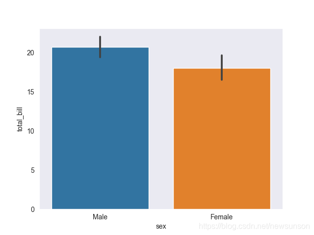
柱状图
男性女性给的小费差异,默认来看是通过男性给小费的平均值和女性给小费的平均值来进行比较,也可以通过中位数estimator = np.media,标准差np.std,协方差np.cov来估计
1 | sns.barplot(x = 'sex', y = 'total_bill', data = tips_df, estimator=np.mean) |
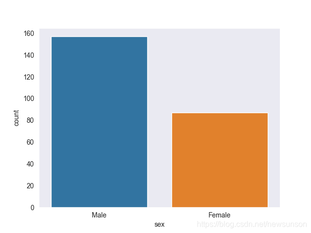
计数图
与之相比,计数图可以对某个数据集统计数量
1 | sns.countplot(x = 'sex', data = tips_df) |
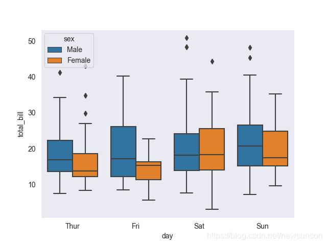
箱型图
这种图不是很懂啊,希望有大佬来分析以下QwQ
1 | sns.boxplot(x = 'day',y = 'total_bill', data = tips_df, hue = 'sex') |
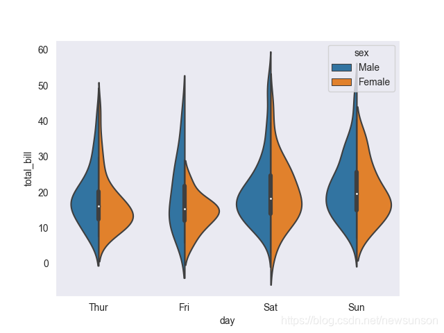
小提琴图
同上,感觉这图有点骚,大概就是代表数据的分布。
1 | sns.violinplot(x = 'day',y = 'total_bill', data = tips_df, hue = 'sex',split = True) |
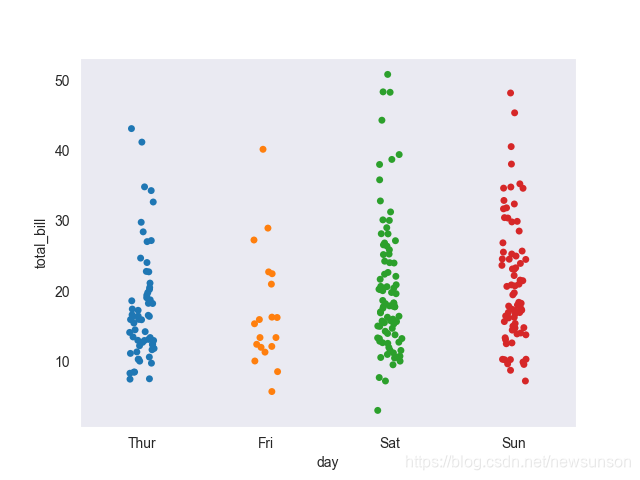
剥离图
这是一个代表不同数据点的散点图,其中一个变量是分类变量,代表着数据的平均分布
1 | sns.stripplot(x = 'day',y = 'total_bill', data = tips_df,jitter = True,) |
分簇散点图
1 | sns.swarmplot(x = 'day',y = 'total_bill', data = tips_df) |
算是小提琴图的点状形式吧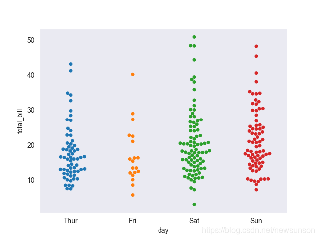
- Post title:seaborn入门(2)继续展示seaborn的各种绘图效果
- Post author:newsun-boki
- Create time:2021-11-02 01:17:55
- Post link:https://github.com/newsun-boki2021/11/02/seaborn2/
- Copyright Notice:All articles in this blog are licensed under BY-NC-SA unless stating additionally.